App Components
Common Components
 Card Component Card Component | 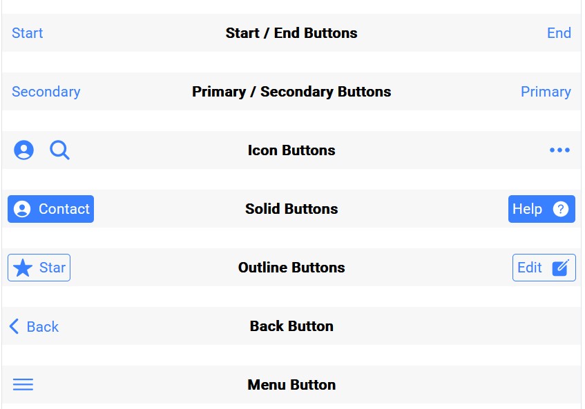 Toolbar Component Toolbar Component | 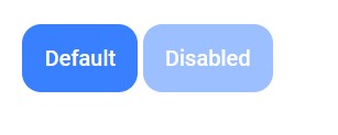 Button Component Button Component |
 Calendar Component Calendar Component | 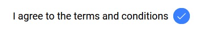 Checkbox Component Checkbox Component | 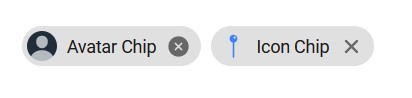 Chip Component Chip Component |
 Toast Component Toast Component | 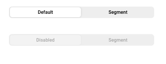 Segment Component Segment Component | 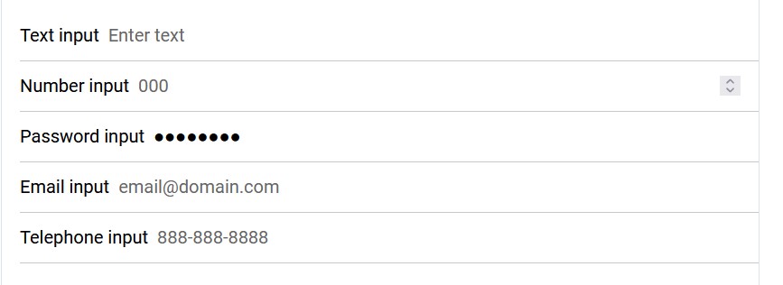 Input Components Input Components |
 Card Component |
 Toolbar Component |
+------------------------------------------------------------------------------------------------------------+-----------------------------------------------------------------------------------------------------------+
|
Toolbar Component |
+------------------------------------------------------------------------------------------------------------+-----------------------------------------------------------------------------------------------------------+
| Button Component |
 Calendar Component |
+----------------------------------------------------------------------------------------+-------------------------------------------------------------------------------------------------------------------------------+
|
Calendar Component |
+----------------------------------------------------------------------------------------+-------------------------------------------------------------------------------------------------------------------------------+
| Checkbox Component |
 Chip Component |
+------------------------------------------------------------------------------------------------------------------------------------------------------------------------------------------------------------------------+
Chip Component |
+------------------------------------------------------------------------------------------------------------------------------------------------------------------------------------------------------------------------+ Toast Component
 Segment Component
 Input Components
Card Component
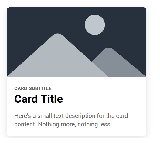
In app development, a card component is a UI element that is used to display a variety of information in a compact and structured format. A card is typically a rectangular box with a border and a drop shadow that contains some content, such as text, images, or interactive elements like buttons or icons.
Cards are often used to present a small amount of information in a clear and concise manner, and they can be arranged in a grid or a list to create a visually appealing and organized layout. Some examples of where card components can be used in app development are:
-
Displaying product information in an e-commerce app: In an e-commerce app, a card component can be used to display product information, such as the product image, name, price, and a short description.
-
Showing news articles in a news app: In a news app, a card component can be used to display articles, with the headline, an image, and a short summary.
-
Showing user information in a social media app: In a social media app, a card component can be used to display user profiles, with their profile picture, username, bio, and social media links.
Overall, the card component is a versatile UI element that can be used in various contexts to present information in a clear and organized manner.
Toolbar Component
Toolbars are useful in mobile app development when there are frequently used actions or navigation elements that need to be easily accessible to the user. For example, a toolbar could include buttons to create a new item, search for content, or access settings. By placing these options in a toolbar, users can quickly access them without having to navigate through multiple screens.
Button Component
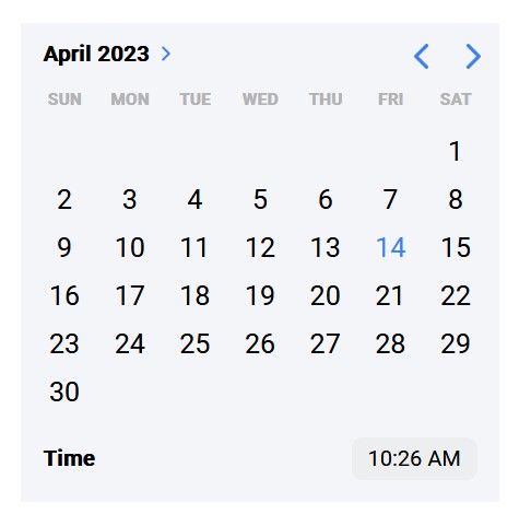
Calendar Component
Checkbox Component
A checkbox is a UI component in mobile app development that allows users to select one or more options from a list of choices. It is typically a small square box with a checkmark inside, and is often used in forms or settings screens.
Checkboxes are useful in mobile app development when you need to provide users with a list of options from which they can select one or more choices. For example, a checkbox could be used to allow users to select multiple items in a shopping cart, or to select which types of notifications they would like to receive from an app.
Checkboxes are also useful when you need to provide users with a clear indication of which options they have selected. When a user selects a checkbox, the checkmark inside the box becomes visible, which provides immediate feedback to the user that their selection has been registered.
One of the main benefits of using checkboxes in mobile app development is that they can help to make the app feel more user-friendly and efficient. They allow users to quickly select or deselect multiple options at once, without having to navigate through multiple screens or menus.
Overall, the checkbox component is a useful UI element in mobile app development when you need to provide users with a list of options from which they can select one or more choices, and when you need to provide clear and immediate feedback on the user’s selections.
Chip Component
A chip is a UI component in mobile app development that represents a small piece of information or a choice that a user has made. It is usually a small rectangle with rounded corners, and can contain text, an icon, or both.
Chips are useful in mobile app development when you need to display small pieces of information or choices in a visually appealing way. For example, a chip could be used to display the tags associated with a blog post, or to show the different types of filters that a user can apply to a search.
Chips are also useful when you need to display multiple choices or options in a limited amount of space. For example, a chip can be used to display the different categories of a product catalog, or to show the different ingredients in a recipe.
One of the main benefits of using chips in mobile app development is that they can help to make the app feel more intuitive and user-friendly. They provide a visual cue that helps users quickly understand what options are available to them, and they can help to reduce the amount of scrolling or tapping required to navigate the app.
Overall, the chip component is a useful UI element in mobile app development when you need to display small pieces of information or choices in a visually appealing and user-friendly way
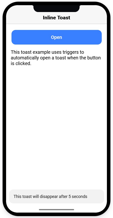
Toast Component
A toast is a UI component in mobile app development that displays a brief message or notification to the user. It typically appears as a small rectangular box near the bottom of the screen, and disappears after a few seconds.
Toasts are useful in mobile app development when you need to provide users with brief, informative messages that do not require any action on their part. For example, a toast could be used to confirm that a user’s message has been sent, or to inform them that a file has been downloaded.
Toasts are also useful when you need to provide users with immediate feedback on their actions. For example, a toast could be used to inform a user that their password has been changed successfully, or to let them know that they have reached their daily limit for a particular feature.
One of the main benefits of using toasts in mobile app development is that they can help to improve the overall user experience of the app. They provide users with quick and easy-to-understand feedback on their actions, which can help to reduce confusion and frustration.
Overall, the toast component is a useful UI element in mobile app development when you need to provide users with brief, informative messages that do not require any action on their part, and when you need to provide immediate feedback on their actions.
Segment Component
A segment is a UI component in mobile app development that allows users to select one option from a set of choices. It typically appears as a horizontal bar with multiple options, and the selected option is highlighted.
Segments are useful in mobile app development when you need to provide users with a set of mutually exclusive options, and you want to make it clear which option has been selected. For example, a segment could be used to allow users to select their preferred payment method, or to choose between different display modes in a media player.
Segments are also useful when you need to provide users with a quick and easy way to switch between different views or modes in your app. For example, a segment could be used to allow users to switch between a list view and a grid view in a product catalog.
One of the main benefits of using segments in mobile app development is that they can help to make the app feel more intuitive and user-friendly. They provide users with a clear and visually appealing way to select their preferred option, and they can help to reduce the amount of tapping or scrolling required to navigate the app.
Overall, the segment component is a useful UI element in mobile app development when you need to provide users with a set of mutually exclusive options, and when you need to provide a quick and easy way to switch between different views or modes in your app.
Tab Component
A tab is a UI component in mobile app development that allows users to navigate between different sections or views within an app. It typically appears as a horizontal bar with multiple tabs, and the selected tab is highlighted.
Tabs are useful in mobile app development when you need to provide users with a way to navigate between different sections or views within your app. For example, a tab could be used to allow users to switch between the home screen, the settings screen, and the profile screen.
Tabs are also useful when you need to provide users with quick and easy access to different features or functions within your app. For example, a tab could be used to allow users to switch between the different categories of products in a product catalog, or to switch between different modes of a game.
One of the main benefits of using tabs in mobile app development is that they can help to make the app feel more organized and intuitive. They provide users with a clear and visually appealing way to navigate between different sections or views within the app, and they can help to reduce the amount of tapping or scrolling required to find what they are looking for.
Overall, the tab component is a useful UI element in mobile app development when you need to provide users with a way to navigate between different sections or views within your app, and when you need to provide quick and easy access to different features or functions.